
Dávid Tlčimuka: designing demanding content into an attractive experience
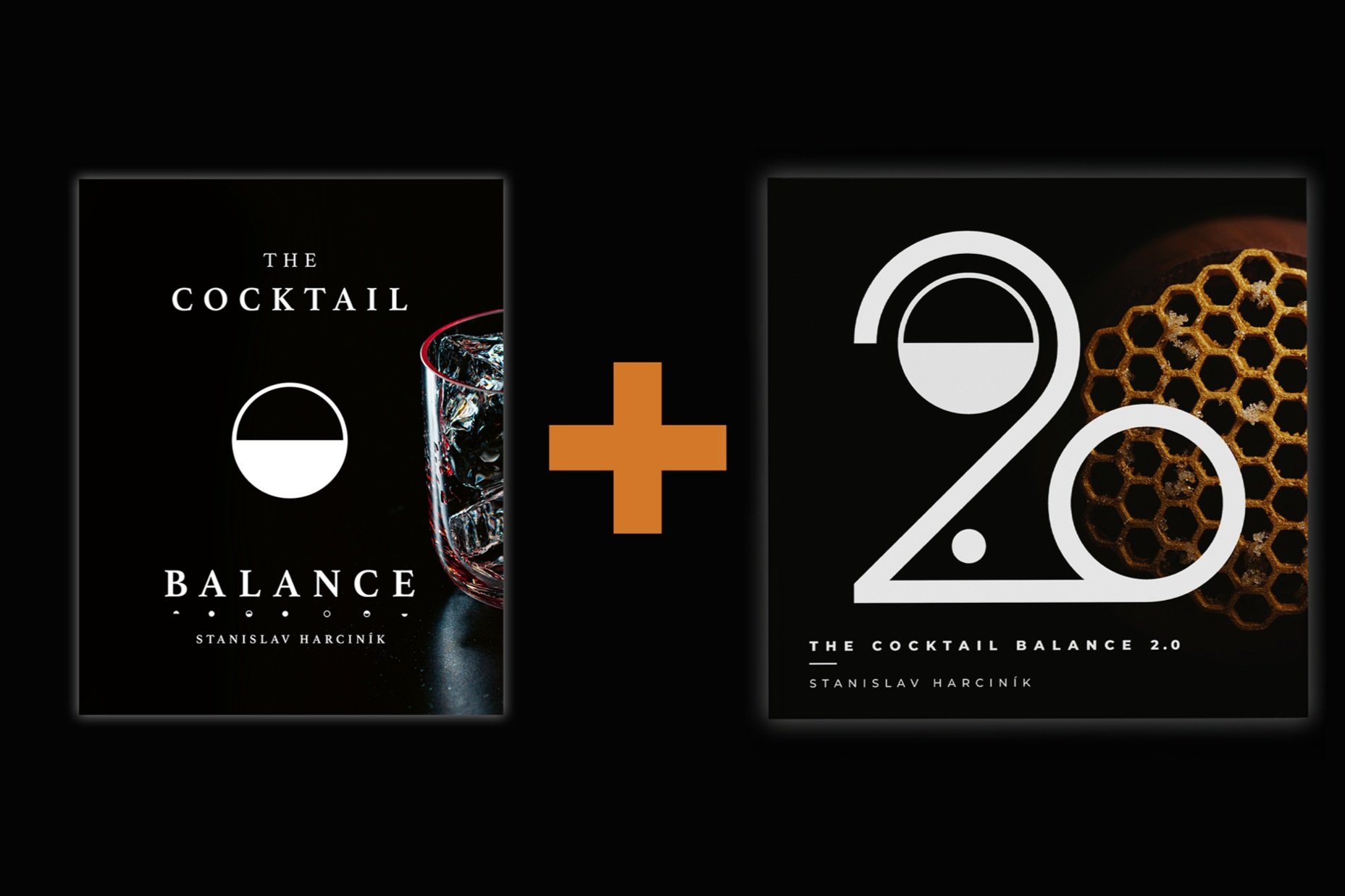
We’re delving into the making of The Cocktail Balance 2.0, revealing the secrets, struggles, and attention to details that go into making a book.
Eva Polgary shared the design of the glassware in the book, and now Dávid Tlčimuka reveals those design decisions that influence the reader experience.
Dávid is a graphic designer and has been involved with creating The Cocktail Balance company branding and design from the beginning. He is also responsible for designing Balance drink labels, the two books, and our various presentations and educational materials.

What did you learn designing the first book?
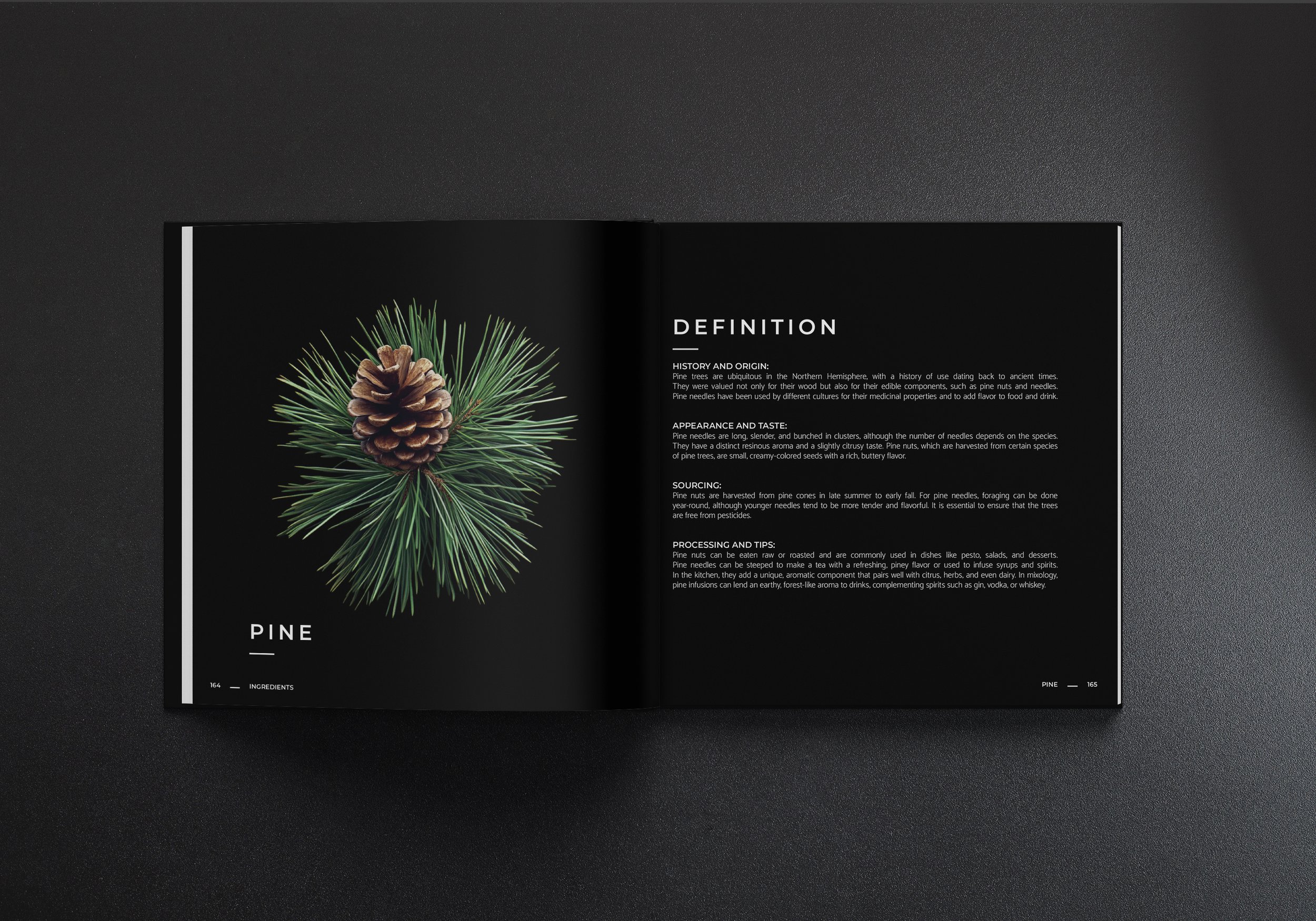
When designing my first book, “The Cocktail Balance,” I realized how many details there were to consider. It wasn’t just about choosing a font family for the headings and body text that would be consistent throughout the book, or designing the graphic elements that would appropriately supplement the text, but especially the preparation of the photographic data so that it prints in sufficient brightness. There is a lot of theory involved in this, which had to be studied and then communicated with the printer. Since we planned from the beginning to print cropped photos of ingredients and drinks on a background coated in deep black, it was crucial to prepare customized photo data.
In addition, I would like to mention the paper selection that the printer themselves guided us in from the first visit. With their knowledge, we were able to choose the paper that brings Adrián's detailed photographs to life. The texture of the paper was also one of the key attributes where we wanted to achieve a feeling of "quality" from the first contact of the reader with the book. We were so satisfied with the paper selection in the first book that we also used it for the second book.
What are some differences when designing for print vs digital?
Given the two different worlds, there are a lot of differences.
One of the most basic ones is color. In digital, we use a color environment called RGB, short for the colors from which all colors for this environment are created - Red, Green and Blue. Printing uses the CMYK environment, where we get all the colors by mixing 4 basic ones - Cyan, Magenta, Yellow, Black (in the old days, black was called “KEY”). When looking at a monitor, we can perceive approximately 16.7 million colors. In comparison, we can “only” print 16 thousand.
Another important difference is brightness. While we see digital quality based on the monitor we own, when printing we have to use a computer calibrated so that the result will be about 25-30% darker and adjust the design accordingly.
In addition to colors, another big difference is the type of graphics, divided into 2 basic types - bitmap and vector. Bitmap graphics are similar to a mosaic made up of small squares, i.e. pixels. The higher the resolution of a given graphic, the more pixels it contains and therefore the better quality it is. On the other hand, vector graphics are simple graphics created using curves. Using a mathematical equation with lines and curves with fixed points that can have a defined fill, we can create graphics that do not lose quality when changing size.
The last of the most fundamental differences I would mention is use. While digital graphics are displayed based on the quality of the monitor available, which we cannot influence, when printing, we have to think ahead when choosing paper. Paper has a fundamental influence on how the design will look in the end. It is not just the type of paper, there are other parameters that need to be considered - paper weight, matte or glossy paper, surface treatment (for additional protection) or possibly various types of print refinement. It is therefore important to be in contact with the printer and their technologists to have an overview of the printer's capabilities.

What aspect of designing a book do most people not think about/realize?
An aspect that I think people don't realize when creating books is teamwork. The design of a book is not created by the designer alone, quite the opposite. It is the interplay of the editor, photographer, designer, copywriter, printer and technologist. Last but not least, important insights from all team members conclude the demanding cycle of designing such a sophisticated product as a book undoubtedly is.
What goals did you have for the second book design-wise and how did you accomplish them?
When I finished the first book, I had these goals for the second book in mind :
1. Improve readability throughout the book
2. Optimize text wrapping for better flexibility
3. Text categorization for better orientation in large blocks of text
4. A more eye-catching and contrasting cover
5. Take the entire visual of the book to the next level
1. Improve readability throughout the book
Better readability was the key aspect on the basis of which I decided to change the format of the book. From the original format of the first book (190x240 mm) I switched to a square format (240x240). This allowed me to create more space for the text, which opened up more flexibility when working with it. In addition, I could enlarge the text to be more prominent even in poor reading conditions where there is a lack of natural light for the reader.
2. Optimize text wrapping for better flexibility
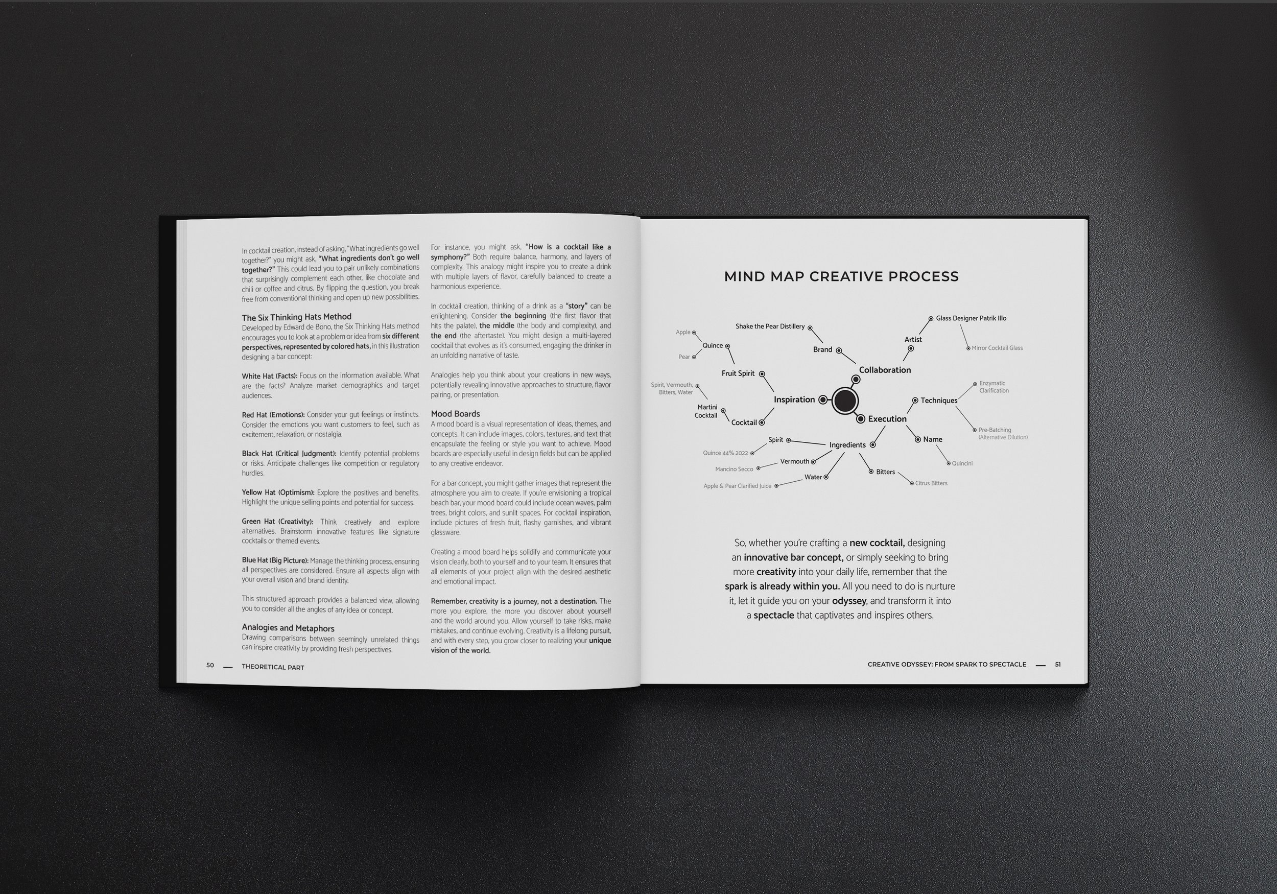
Text wrapping is essentially the way a designer inserts text into a book. For the second book, it was important to choose a wrapping system that would allow for working with different text sizes without compromising the consistency of placement. We call this system very pragmatically - a grid system. Using grids, we can consistently place text in a way that allows the reader to navigate safely through all the chapters in the book without even knowing it. The design solution in this case was the so-called modular grid. It is a system for arranging objects in space based on rows and columns of a certain size. Fields are places where units of content can be placed, such as text blocks, headings, inserts and images. Using the modular grid, I was able to eliminate one of the problems of the first book - the stereotype of the text, when large blocks of text make it hard to read and easy to get lost.
3. Text categorization for better orientation in large blocks of text
The modular grid itself offered me more flexibility, but it still didn't solve the main nightmare of all readers: long and endless blocks of text. That's why we decided to create more coherent blocks and classify them into categories and subcategories. Thanks to this, the reader can better focus on the text itself and possibly go back with their eyes if needed to read a given category from the beginning.
4. A more eye-catching and contrasting cover
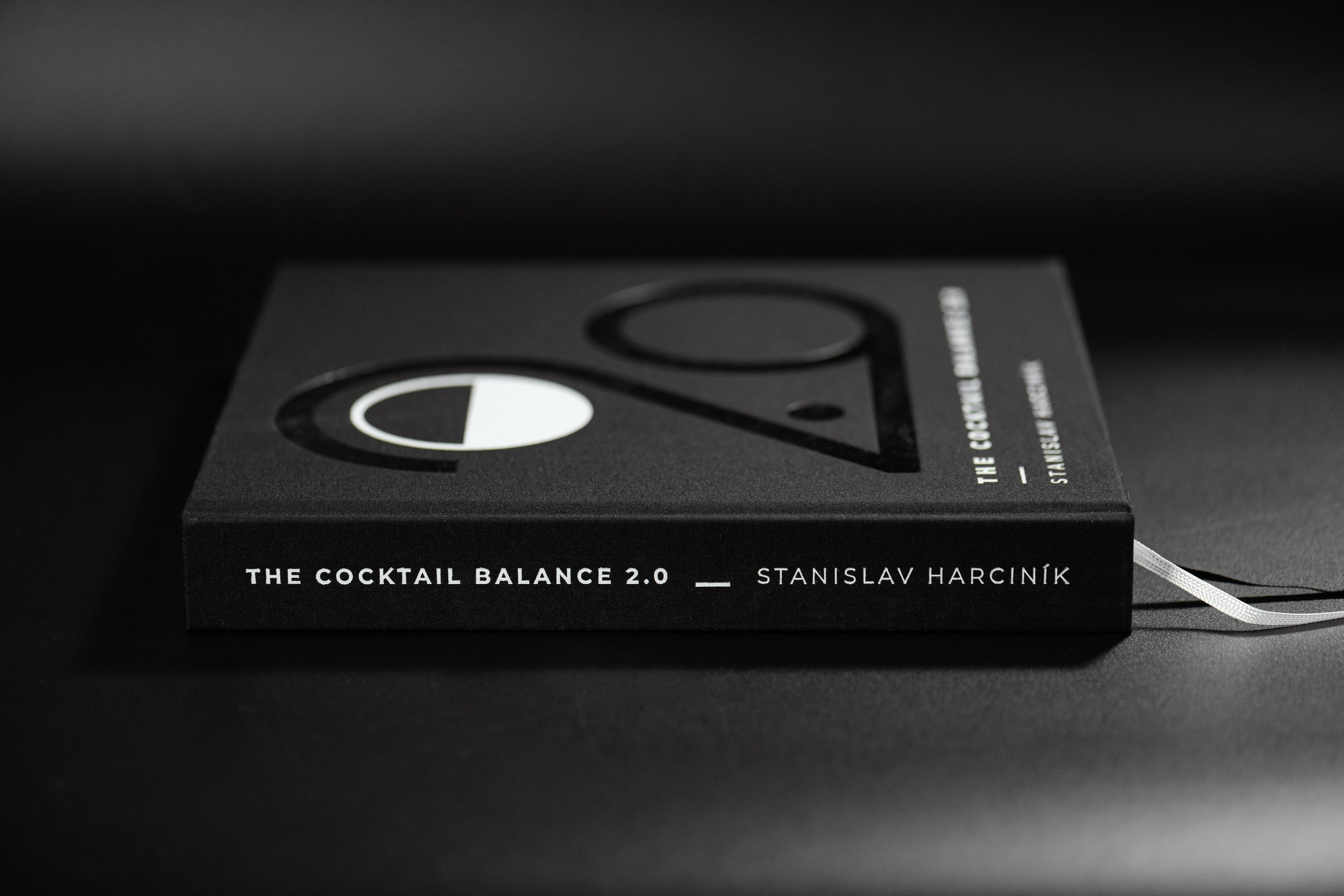
We agreed from the beginning that, similar to the English version of the first book, the second book would also have a full book cover. Despite this fact, we wanted to create a much more eye-catching and contrasting hardcover that would stand out if the reader decided to “uncover” the book. Since we have a solid hardcover board - canvas covered with textile - it was not possible to “print normally” on it. It was necessary to make a die and literally “stamp” the graphics into the board. The proposed design consisting of the symbol of The Cocktail Balance and the title of the book with the author was stamped and covered with white matte foil. Thanks to this, we created a contrast to the large number 2.0 covered with dark shiny foil.
5. Take the entire visual of the book to the next level
Thanks to all the changes mentioned above, breathtaking photos taken with varied composition and attention to detail, the whole team and I managed to take the complete visual of the book to the next level. The result is worth it.
Did the evolution of AI between the two books play a role in the second?
Definitely, and not a small one. Thanks to more advanced AI, we were able to create seasonal ingredients that were not normally available during the photo shoot. AI also played a large role in creating lists for the Index section of the book, which would otherwise have taken me several hours to create.
What was the hardest aspect of making 2.0?
The hardest aspect was the adaptation of demanding content to the design concept of the book. Simply put - to create the impression not that the reader is reading an encyclopedia but an advanced and design-attractive testament to Stan Harciník's experience and knowledge. Finding the right balance was a challenge that lasted from the first inserted text to the final thanks on the last page.
What are you most proud of in the book?
Overall, I am most proud of our entire team. Combining so many views, opinions and ideas into one functional form is always a difficult process full of compromises and long conversations. Despite this, I did not feel that my hands were tied and I could always turn to anyone on the team who provided me with maximum support.
But there is one thing - rather a moment that filled my body with a strong sense of pride. It was the moment when Adrián and I came to the printing house in Martin to review the first prints. Seeing sharp, detailed, deep and color-perfect prints was a strong wow-moment. The final transformation of the book into tangible form came out beautifully and it is a joy to leaf through it and enjoy the photos, whether of drinks, ingredients or portraits.
The goal of taking the book to the next level was fulfilled to the letter and I am already looking forward to the next challenge that we will face as a team. Lets go!!!
Both The Cocktail Balance and The Cocktail Balance 2.0 are available in our shop.